UI UX design mistakes
User experience or UX, refers to the way a person feels when interacting with a website, application, or mobile app. Common UX design mistakes aren’t always easy to identify. You don’t want people to label your UX as confusing or hard to navigate, do you? Then what is wrong with UX? How do you avoid UX mistakes if you don’t know what they are?
[Summary]
There are many common user experience (UX) mistakes that are related to user behavior. Some of the most common include:
- Confusing navigation
- Lack of clear calls to action
- Poorly designed forms
- Slow loading times
- Lack of mobile optimization
- Lack of personalization
- Lack of clarity
In today’s highly competitive mobile app market, it is even more important than ever to differentiate your brand and create a seamless user experience through effective design. Web designing and development companies must recognize the importance of mobile app design for long-term success., A good UX design can help create new business opportunities to gain a competitive advantage.
User retention is an important aspect of user experience (UX) design. There are several best practices that UX designers can follow to help increase user retention. First and foremost, it’s important to provide a seamless and intuitive user experience. This means designing an easy-to-navigate interface, making sure that all features and functions are easy to use and understand.
Additionally, it’s important to regularly gather feedback from users and use this information to make ongoing improvements to the user experience. Finally, providing users with a sense of community, whether through social features or personalized recommendations.
Importance of outstanding UX design
An outstanding UX design can lead to increased customer satisfaction and loyalty, which can ultimately drive sales and success for a company. Good UX design aims to make products easy to use and intuitive for the user. It can encourage customers to continue using the product and recommend it to others.
On the other hand, poor UX design can lead to frustration and confusion for the user. It will result in a negative experience and potentially drive customers away. Ensure that your products are effective and appealing to your target audience with good UX design.
10 common UI UX design mistakes in 2024
One common mistake is failing to prioritize the needs of the user. It’s easy to get caught up in the latest design trends or the coolest new features. But if they don’t justify the needs of the user, they are ultimately pointless.
Instead, designers and developers should focus on creating a design having intuitive navigation, fast loading times, and a simple design. By following best UX practices, UX designers can keep users engaged and coming back to their product or service. Here’s a guide to help you navigate the common UX design mistakes.
Mistake 1 – Not Following the Iterative Design Process
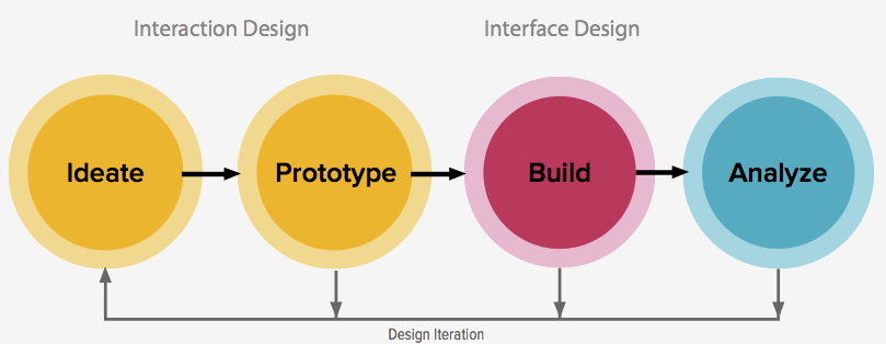
Mistake – The mistake is not following the iterative UX design process. UX design is an iterative process with ideation, prototyping, and testing. So, a designer should learn to resolve user’s issues. As you check each iteration of your prototype, keep in mind that it’s going to grow and change based on feedback and testing.
Example – One example of not following the iterative UX design process could be rushing through the design phase without gathering enough user feedback or testing. This might result in a product that is not user-friendly or does not meet the needs of the target audience.
Instead of iterating and refining the design based on user feedback, the team may simply move forward with the initial design without addressing any issues or concerns. This can lead to a poorly designed product that does not meet the desired goals or objectives, and may even require costly redesigns or updates in the future.
Fixes – The UX design process is to create a clear and detailed project plan that outlines each step of the process. This plan should include specific tasks, deadlines, and checkpoints to ensure that the process is followed correctly. Additionally, it may be helpful to assign specific tasks to team members to oversee each step of the process.
Another solution is to regularly review and assess the progress of the project to identify any areas where the process may have been neglected or skipped over. This will help to take corrective action as necessary. Finally, it may be helpful to seek guidance and feedback from UX design experts or mentors. They can guide you to ensure the ux design process is being followed correctly
Mistake 2 – Making the Interface Too Complex or Cluttered
Mistake – An interface that is too complex or cluttered can be difficult for users to navigate and can cause frustration.The browsing experience of the user is poor due to several reasons such as slow website loading, too many images on page , images taking time to load and so on.
To avoid this, it is important to keep the design as simple and clean as possible. Only the necessary elements and features should be included in page design.
Example – Designing an interface with too many buttons, menus, and options? It can lead to bad UX. This can make it difficult for users to find what they are looking for, as they may become overwhelmed by the sheer number of choices presented to them.
In addition, a cluttered interface can make it harder for users to understand how to use the product or service, as there may be too much information displayed at once.
Fixes – To avoid this, it’s important for UX designers to keep the interface simple and streamlined, and to only include the necessary elements that will help users achieve their goals.
Mistake 3 – Not Making the Interface Visually Appealing
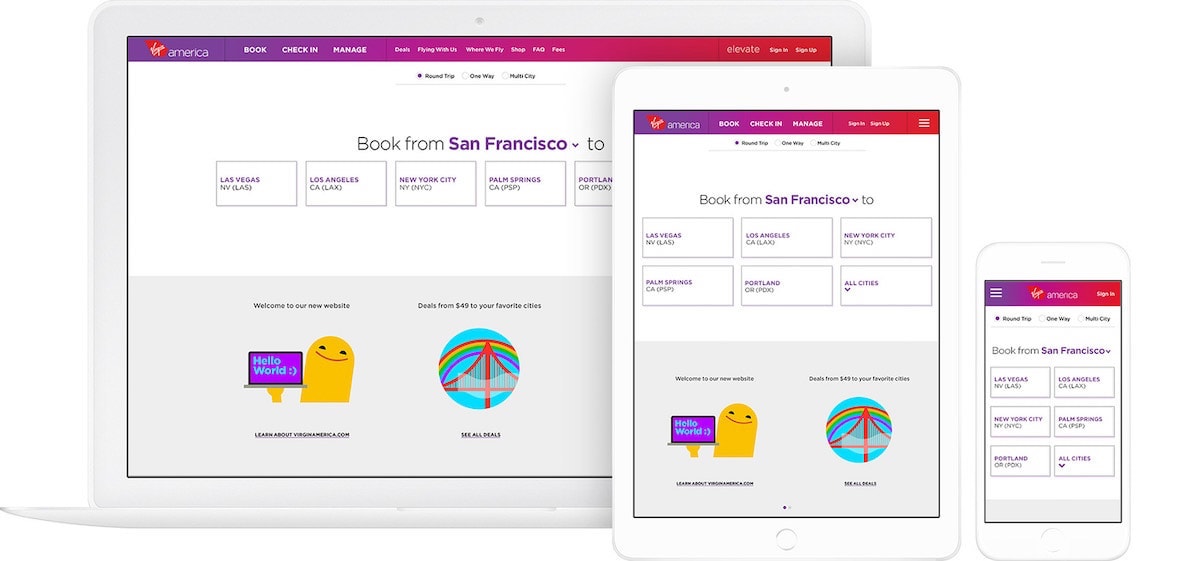
Mistake – If the interface is not visually appealing, it may be difficult for users to navigate and use the application effectively. It can also make the website look outdated or unprofessional, which can lead to users losing interest in using it. Therefore, it is important to make the interface visually appealing in order to improve the user experience and keep users engaged.
Example – If you are designing a website that is cluttered and unorganized, with poor color choices and a lack of consistency in design elements. This can make the interface confusing and difficult to navigate. This can lead to a frustrating user experience.
Fixes – The visual design includes layout, color scheme, and typography. It has a significant impact on the user experience (UX). An attractive design is more engaging, while a poorly designed interface is frustrating. In addition to color scheme and layout, using white space effectively to separate different elements are essential elements.
In contrast, a visually appealing interface would be visually appealing and well-organized, with a cohesive design and a clear hierarchy of information. This can help to make the interface more intuitive and easy to use, resulting in a better user experience.
Mistake 4 – Failing to Provide Clear and Helpful Error Messages
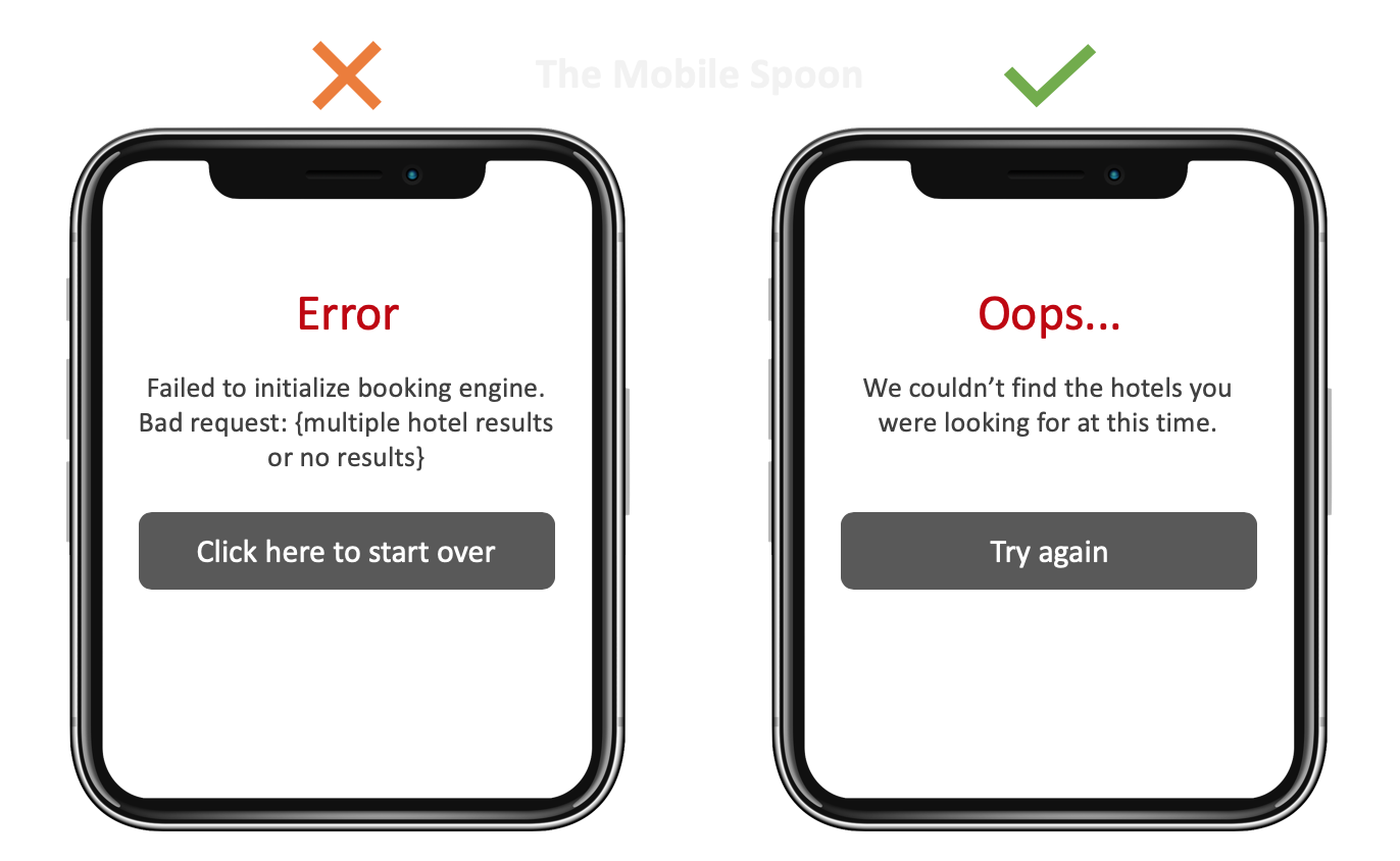
A clear and helpful error message should explain what went wrong and how to fix it without being too technical or confusing. If error messages are not clear, it can lead to user frustration. As a result , they might leave the website and go to the competitor’s website. To avoid this, it is important to carefully consider the language and tone of error messages. The error messages must have specific instructions to resolve the issue.
Example – Failing to provide clear and helpful UX error messages would be a website that displays a message simply stating “Error” when a user tries to submit a form with incorrect information. This message does not provide any helpful information or guidance to the user on how to fix the error and move forward.
Fixes – A more effective error message would specify what the error is and provide suggestions on how to fix it. It could be such as “Please enter a valid email address” or “Your password must be at least 8 characters long.” This helps the user understand what went wrong and how to correct it. This will help in improving their overall experience on the website.
Mistake 5 – Overwhelming Users With Intrusive Pop-ups
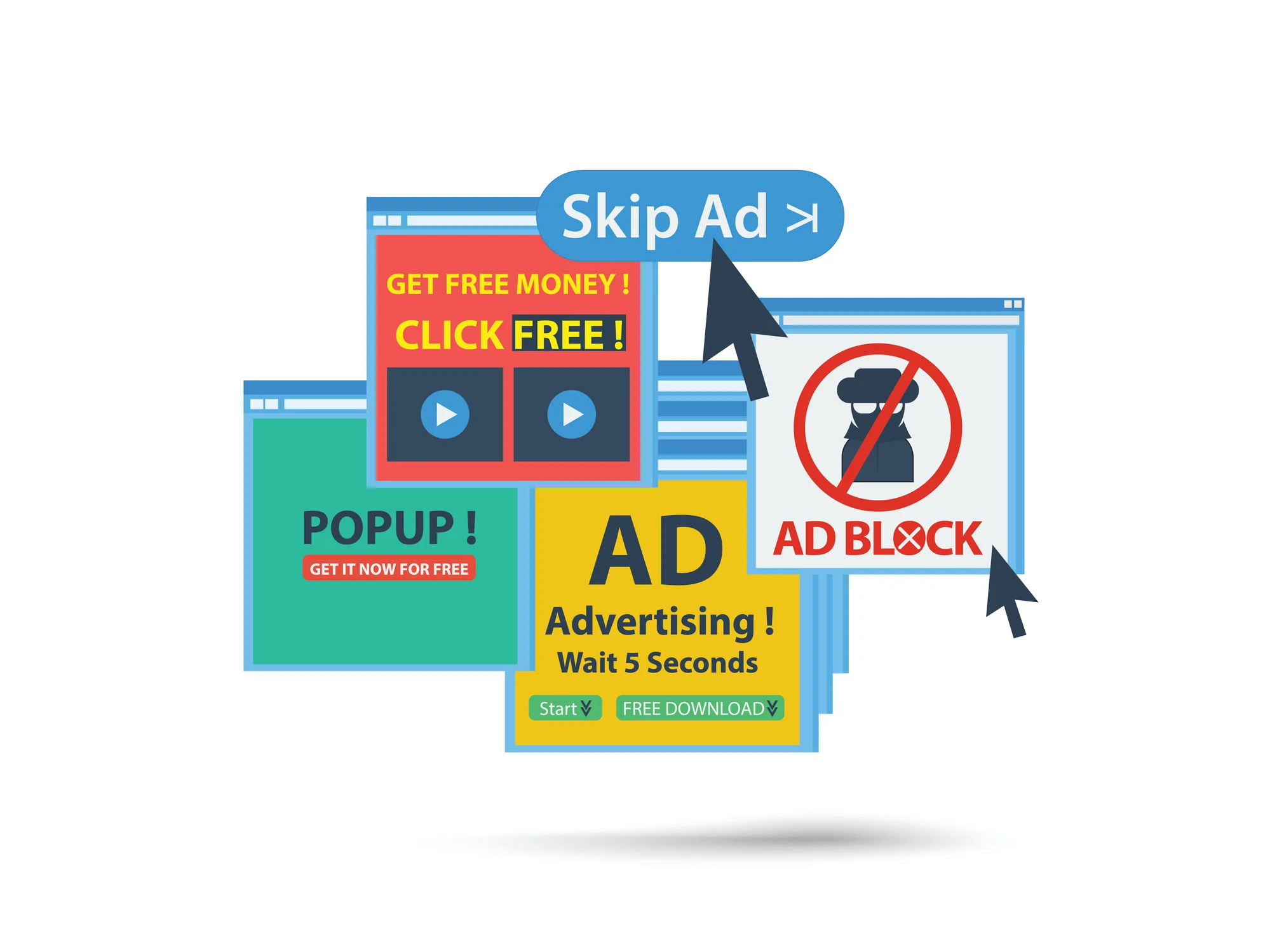
Mistake – It can have negative consequences for both the user and the website. Intrusive pop-ups are those that are disruptive to the user experience, often appearing unexpectedly and interrupting the user’s browsing or task completion.
In addition to the negative impact on user experience, overwhelming users with intrusive pop-ups can also negatively impact a website’s search engine ranking.
Example – An example of overwhelming users with intrusive pop-ups would be a website that constantly displays pop-ups for newsletters, sales, or surveys, even when the user is actively trying to navigate the site. These pop-ups often cover up important content and can be annoying and distracting for the user, potentially causing them to leave the site in frustration.
Fixes – Limit the number of pop-ups displayed to the user, or to offer the option for the user to opt-in or opt-out of receiving pop-ups. Additionally, ensuring that the pop-ups are relevant and useful to the user can help to decrease the sense of intrusion. Finally, providing an easy and obvious way for the user to close the pop-up can also help to reduce frustration.
Mistake 6 – Ignoring Responsive Design and Not Optimizing for Mobile

Mistake – Currently, mobile devices such as smartphones and tablets attract more than 50% internet traffic. If your website or application is not optimized for mobile, users can’t access your content on their devices.
This can lead to a poor user experience. As a result, users will go away from your site leading to decreased website traffic and revenue. Additionally, search engines like Google may penalize non mobile -friendly websites.
Therefore mobile optimization is a must. A responsive website design is more efficient, cost-effective, and easier to manage compared to separate mobile and desktop versions.
Example – One example of this is if a company has a website that is not optimized for mobile devices. When users access the website on their phones, they may have difficulty reading the text, navigating the site, or accessing certain features. As a result, they may become frustrated and leave the site, leading to a high bounce rate and a decrease in conversions.
This can be especially problematic for e-commerce sites, as users who have a poor experience on mobile may be less likely to make a purchase.
As per binus university, Understanding of UX will help designers developing design that can be effectively communicate with their segement.
Fixes – To fix these issues, ensure that the website is responsive and optimized for mobile devices.
Mistake 7 – Not Considering the User’s Needs and Goals
Mistake – It is important to design and develop products and services with the user in mind, taking into account their needs and goals. A good UX leaves a lasting impression. A designer must create a connection with the user’s needs. Meaningful websites and apps align with users’ needs. In UX design, visually pleasing apps often lack meaning.
Example – let’s say a user is looking for information on how to fix a common household appliance. They go to the website of a company that sells these appliances and expect to find helpful troubleshooting information. However, instead of finding the information they need, the website is filled with promotional content and sales messages.
The user is unable to find the information they need and becomes frustrated, leading them to leave the website and potentially look elsewhere for a solution. In this case, the company’s focus on promoting their products took priority over the user’s needs and goals, which resulted in a poor user experience.
Fixes – Fixing the issue of not considering the user’s needs and goals, involves researching and understanding what the user needs from the product or service. Once you know it, design and implement solutions that meet those needs and goals.
Mistake 8 – Not Testing the UX With Real Users
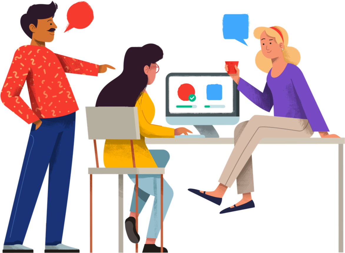
Mistake – It is important to test the user experience (UX) of a product or website with real users to ensure that it is effective and meets their needs. Testing with real users can provide valuable insights and help identify any issues or problems that may not have been apparent during the design and development process.
Without testing with real users, it is possible that the UX may not be as effective as it could be, leading to a poor user experience. There are several methods for testing the UX with real users, such as usability testing, focus groups, and user interviews, which can help to gather valuable feedback and improve the final product.
Example – Suppose a company is releasing a new e-Commerce website without conducting any user testing. They may have spent a lot of time and resources on the design and development of the site. But do you know that without testing it with actual customers, they risk releasing a product that is difficult to navigate or confusing to use. This can lead to poor user experiences and ultimately result in lost sales and customer dissatisfaction.
Fixes – One solution to this issue is to conduct usability testing with real users. This can be done through various methods such as focus groups, user interviews, or online surveys. By getting feedback from actual users, designers can ensure that the user experience is intuitive and effective.
Mistake 9 – Following Your Competition Too Closely
Mistake – When you follow your competitor’s design, you are taking a big risk. Every business has some unique things to offer its clients. If the designer’s focus too much design trends, it will lead to a bad UX.
To avoid this , designers and developers must analyze the need of business and accordingly design a website . You can always improve , customize and redesign your website to have a stronger UX .
Example – if the competition is able to quickly iterate and improve upon their product, the copying company may struggle to keep up and risk falling behind in the market. Instead of simply copying the competition.
It can be more effective for a company to carefully research and analyze the market and their target audience, and then use this information to create a unique and differentiated product or service that meets the needs of their customers.
Fixes – It Involves finding your own unique design solutions and not simply copying what your competitors are doing. It may also involve conducting user research to understand the needs and preferences of your target audience.
Mistake 10 – Not Updating and Maintaining UX Design
Mistake – If you are not making any changes or improvements in UX design, this can increase website bounce rate. Failing to update and maintain the UX can lead to a poor user experience. A regular maintenance will avoid such user difficulties.
Example –
- Lack of relevance: If the design is not updated, it may become outdated and no longer relevant to the target audience.
- Poor user experience: An outdated design may not be user-friendly and may lead to a poor user experience.
- Decreased engagement: If the design is not appealing or engaging, users may be less likely to interact with the product or service.
- Reduced sales: If the design is not up-to-date, it may lead to a decrease in sales as users may not trust or want to use the product or service.
Fixes – A designer must consider the changing needs of the end users. It helps in creating relevant changes in design. To remain effective, websites must regularly update and maintain their user experience (UX). Making small changes to the design, such as fixing bugs or adding a button or a Call to action ( CTA ) on a page can improve UX.
Conclusion
In conclusion, UX design mistakes can have a negative impact on user experience and ultimately the success of a product or website. It is important for designers to be aware of common pitfalls and take steps to avoid them, such as conducting thorough user research, keeping the user’s needs and goals in mind, and testing prototypes before launching a website. By addressing and correcting these mistakes, designers can create a more seamless and enjoyable experience for users.
You can create interactive, dynamic, and functional designs. Always remember, there can be improvisation in the design as per product changes or user needs. A design must have the flexibility and adaptability to implement changes.
Here at RedBlink, we specialize in creating user-friendly web designs for a variety of projects. Checkout our portfolio page, showcases our completed work and demonstrates our expertise in UX design.
If you have a new project in need of top-quality design, you can rely on our UI UX Design Services) .”

Director of Digital Marketing | NLP Entity SEO Specialist | Data Scientist | Growth Ninja
With more than 15 years of experience, Loveneet Singh is a seasoned digital marketing director, NLP entity SEO specialist, and data scientist. With a passion for all things Google, WordPress, SEO services, web development, and digital marketing, he brings a wealth of knowledge and expertise to every project. Loveneet’s commitment to creating people-first content that aligns with Google’s guidelines ensures that his articles provide a satisfying experience for readers. Stay updated with his insights and strategies to boost your online presence.
