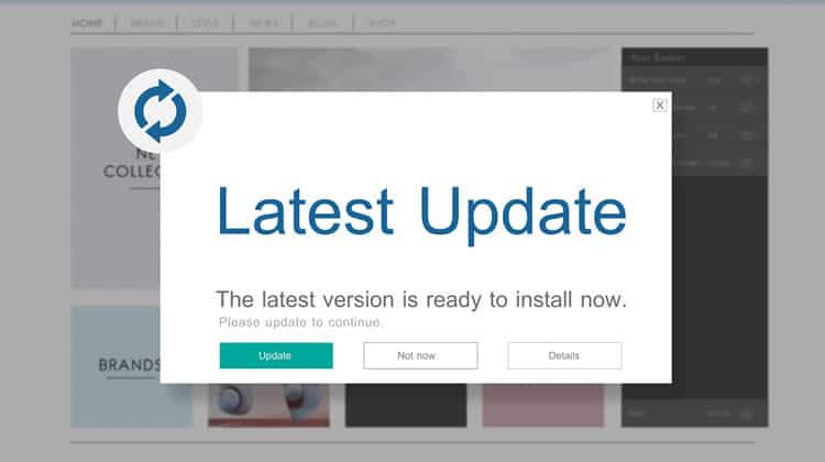
Popup UX Design
Introduction
An effective way to introduce users to your product is with pop-ups. On one hand, they can be an effective way to increase conversions, promote special offers, and gather information. On the other hand, they can be intrusive and annoying, causing users to leave a website or disable pop-up blockers.
Correctly used, they can be extremely effective, but they can also backfire horribly if they are not executed properly. Even an experienced designer gets stuck while creating a popup for a website. Designers should have clear and loud answers to the every questions before he or she starts designing a Popup.
Contents
Key Factors for Designing User-friendly Pop-ups

Key Factors for Designing Effective and User-friendly Pop-ups for a Website refers to the important considerations that designers must take into account when creating pop-ups for a website. These factors include
✔️ Understand the user’s intent
✔️ Keep it simple
✔️ Use clear language
✔️ Be mindful of timing
✔️ Limit the number of pop-ups
✔️ Test different designs:
✔️ Use exit-intent technology
✔️ Mobile-responsive design
✔️ Don’t forget accessibility
✔️ Evaluate your pop-up’s performance
The key is finding the right balance while using popups on a website. Instead of being intrusive, they should help users.
Popups influence user engagement on websites and apps. Striking the right balance will improve user engagement
In this article, we will learn about the role of pop-ups in user engagement & tips for striking a balance.
If you come to know that highly converting popups can increase a website’s traffic by 40-60%, then you should also know how these popups can really increase user engagement.
The following statistics will shed some light on the need for adding popups, which will increase website’s user engagement –
- The top 10% of highest-performing popups had a 42.35% average conversion rate.
- Popups that take up the entire browser window can lead to a conversion of 14.40%.
- To have improved performance, wheel popups (13.23%) have performed better than simple popups (5.10% – 7.65%).
Generally, popups are included for the following purposes:
- To increase social media following
- Answer a frequent customer question
- Promote the products
- Conduct a Survey
- Grow an Email List
The Pros and Cons of Using Pop-ups

Pop-ups are widely used as a marketing tool and user engagement. They can increase conversions, promote special offers, and gather information. On the other hand, they can be seen as intrusive and annoying, leading to website’s high bounce rate and a poor user experience.
In this article, we will explore the pros and cons of using pop-ups to help you make an informed decision about whether or not to include them on your website.
Pros:
- Pop-ups can be used to grab the attention of users and encourage them to take a specific action, such as subscribing to a newsletter or making a purchase.
- Pop-ups can be effective in gathering user information, such as email addresses or demographic data.
- Pop-ups can be used to promote special offers or discounts, which can drive sales and revenue.
Cons:
- Pop-ups can be disruptive and annoying to website users, especially if Popups appear too frequently or unexpectedly.
- Pop-ups can interfere with the user’s ability to view and interact with the main content on the website.
- Pop-ups may be blocked by some browsers or ad-blockers, which can prevent them from being seen by users.
- Pop-ups may decrease the overall credibility and trustworthiness of a website if they are perceived as spammy or deceptive.
It is important to carefully consider the potential impact of pop-ups on the user experience before implementing them on a website. It may be helpful to test different types and frequencies of pop-ups to determine their effectiveness in achieving specific goals while minimizing negative effects on the user experience.
Also checkout our post – UX(User Experience) Design Process Stages
Best Practices for High Converting Popups

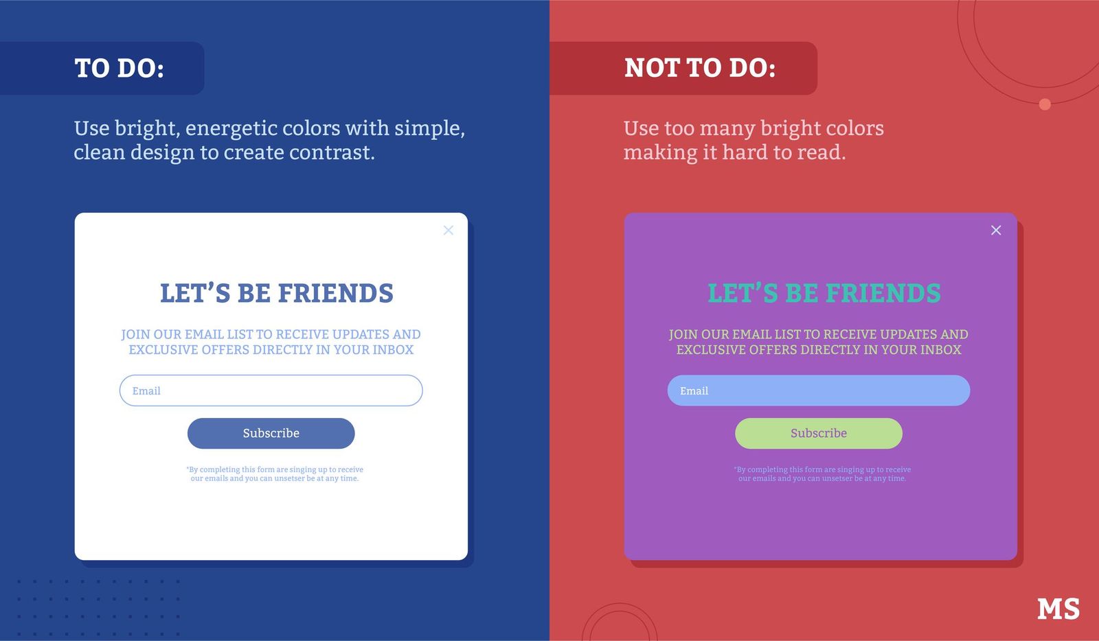
Source – https://marketsplash.com
Here are some best practices for high converting pop-ups:
- Timing: It is important to choose the right time to display the pop-up to your website visitors. Showing it too early may cause them to leave the website, while showing it too late may not be effective.
- Targeting: Make sure that your pop-up is targeted to the right audience. Personalize it based on the visitor’s location, browsing history, and behavior.
- Design: Keep the design of the pop-up simple and clean. Use contrasting colors and high-quality images to grab the visitor’s attention.
- Call to Action: Use a clear and compelling call to action. Make sure that it is easy to understand and that it stands out.
- Exit-Intent: Use an exit-intent pop-up to capture visitors who are about to leave your website. This will give them one final chance to interact with your website.
- A/B Testing: Test different versions of your pop-up to see which one performs the best. Use A/B testing tools to measure the success of each variation.
- Frequency: Limit the number of times the pop-up is displayed to a visitor. If it is shown too often, it can lead to irritation and increase bounce rate.
- Responsive design: Your pop-up should be responsive and works well on different devices such as desktop, laptop, tablet and mobile.
- Relevancy: Make sure that your pop-up is relevant to the content of the website. This will increase the chances of the visitor interacting with it.
- Privacy: Make sure that your pop-up is compliant with data privacy laws and regulations. Provide an easy way for visitors to opt-out if they do not want to receive your pop-up in future.
Tips for finding the right balance with pop-ups
Pop-ups can help to promote content, collect email addresses of website visitors, and drive conversions. Here are some tips for finding the right balance with pop-ups:
Add the Right Popup Format
There are different types of popups. Some common types include
- Classic, middle-of-the-screen, lightbox popups
- Popups that move in from the side
- Full-screen popups
- Top and bottom bars
All of them are used in a variety of ways. A designer should know which type of popup are highly convertible?
Set the Timing to Display the Popup
To get the timing right and make sure your popups are relevant, here are a few things you can play around with:
- Time until a popup appears
- After how many pages a user will see it
- Percentage of the page they need to scroll
- Showing popups only when someone is about to leave the site
- Offering them only on a specific page
Some Other Tips You Shouldn’t Missed Out
Website Integration is a Must – One of the first steps to designing effective pop-ups is to ensure that they integrate well with the rest of your site. You can do so by including branding elements such as your site or company logo, colors, fonts, and tone.
Create a clear user path – You should regard popups as mini landing pages to reduce shopping cart abandonment. After all, they have the same function: move the user along a given path to a specific goal.
State a compelling CTA – Speaking of clarity, the single goal of any popup is to get users to take action. It’s not a place to start a conversation, introduce yourself. You need to address the audiences directly.
Include visual elements – Images and other visual elements are an important part of a website. Plenty of research on the topic shows that they make web pages more appealing, especially if they include people rather than just being stock or clipart.
Allow easy closing of popups – It is better to have full control with a close button. It is considered a bad UX ( user experience ) if the popup doesn’t close.
Make sure to create separate mobile versions – Pop-ups can play an important role in increasing user engagement on your website, but it’s important to consider the user experience on both desktop and mobile devices. One way to do this is to create separate versions of your pop-ups for desktop and mobile users. This can help ensure that your mobile users have a positive experience on your website.
Apart from this, you should design a popup with minimum fields and shorten Calls-to-Action. You can use images but limited small-size images are preferred.
The Role of User Testing in Assessing Effectiveness
User testing is an important step in determining the effectiveness of pop-ups on your website. It allows you to see how real users interact with your site and can provide valuable insights into what works and what doesn’t.
There are several benefits of pop-ups user testing:
Improved user experience – User testing can help you identify any issues with your pop-ups, such as if they are intrusive or annoying to users. This can help you make adjustments to improve the user experience.
Increased conversions – By testing different types of pop-ups, you can determine which ones are most effective at driving conversions. This can help you optimize your pop-ups for maximum effectiveness.
Better targeting – User testing can help you understand the needs and interests of your target audience, which can inform the content and targeting of your pop-ups.
Conclusion
By following pop design best practices, you can create pop-ups that effectively engage users without causing irritation.
Effective popups make people pay more attention to your product. They can increase your conversion rate.
To learn more about such web designing tips, get tuned to our blog.

Director of Digital Marketing | NLP Entity SEO Specialist | Data Scientist | Growth Ninja
With more than 15 years of experience, Loveneet Singh is a seasoned digital marketing director, NLP entity SEO specialist, and data scientist. With a passion for all things Google, WordPress, SEO services, web development, and digital marketing, he brings a wealth of knowledge and expertise to every project. Loveneet’s commitment to creating people-first content that aligns with Google’s guidelines ensures that his articles provide a satisfying experience for readers. Stay updated with his insights and strategies to boost your online presence.
